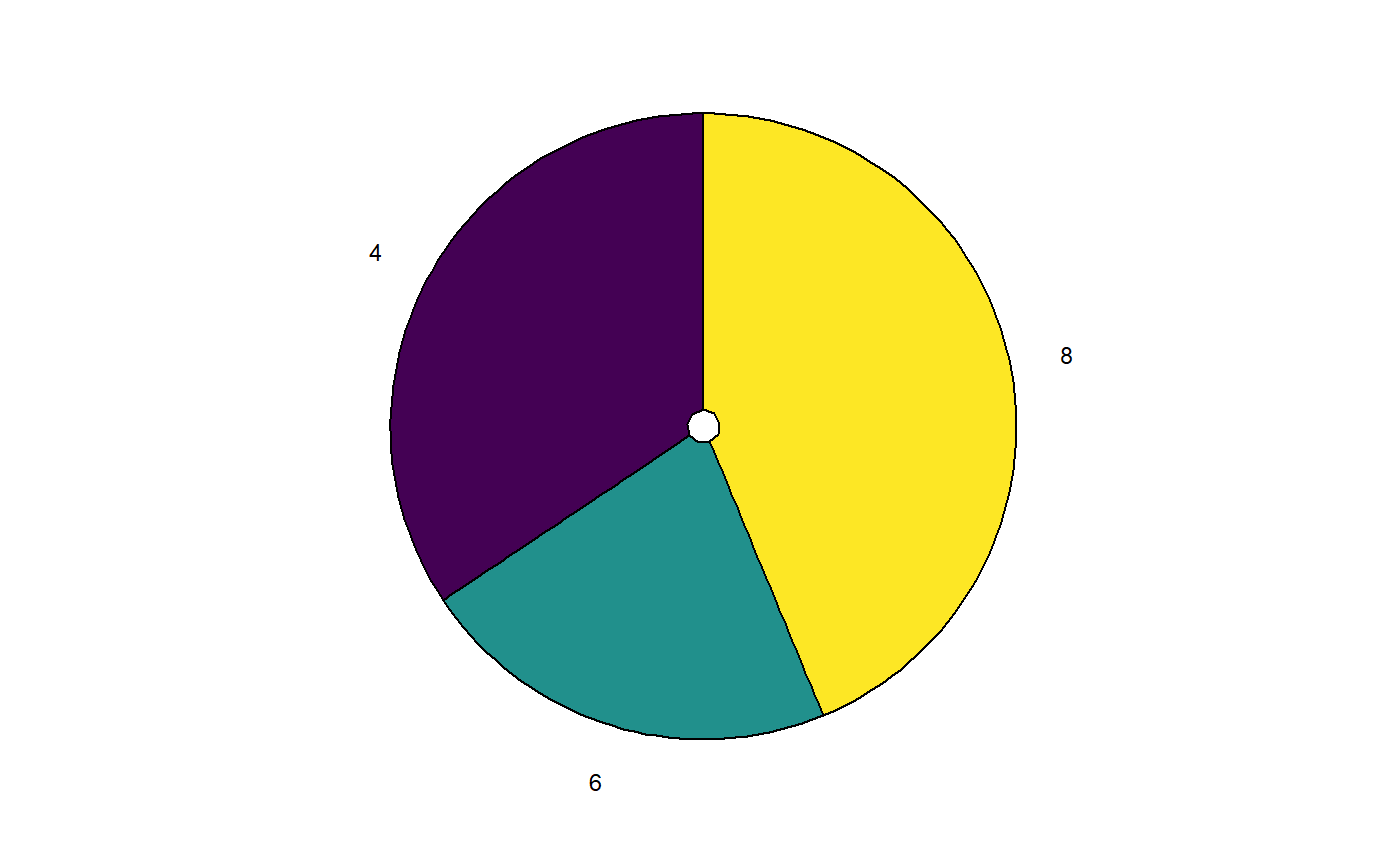
A ggplot pie chart
THis function creates a pie chart. Note that these are generally quite strongly advised against, as people are not good at interpreting relative frequencies on the basis of pie charts.
ggPie(vector,
      scale_fill = scale_fill_viridis(discrete=TRUE))
Arguments
| vector | The vector (best to pass a factor). |
|---|---|
| scale_fill | The ggplot scale fill function to use for the colors. |
Value
A ggplot pie chart.
Note
This function is very strongly based on the Mathematical Coffee post at http://mathematicalcoffee.blogspot.com/2014/06/ggpie-pie-graphs-in-ggplot2.html.
Examples
ggPie(mtcars$cyl);
